


What do you see....... A browser issue


As many of you know, I have recreated my blog, by downloading a simple template from Blogger, and attempting a few hacks to personalize it. The original template was gray, but I saved the images from it, recolored them in Photoshop, and used them in the template instead of the original gray ones. Then, I designed this kind of a line drawing .png image from a photo of my dog, and put it into the title bar. It's as far as I got for now, because I've been in absolute learning mode, and just hacking away at the template until I got it reasonably where I wanted it. The header bar is too wide, and there's this funny light blue patch above and on the right side of the screen, between the header and the Blogger search bar. Ok. Life is good.
Then, an interesting thing happened at work today. A short time after I got there, I opened up Internet Explorer and navigated to this blog. Amazingly enough, and something I never expected, was that the blog appearance was very different. The dog .png image is centered, rather than at the left, it's not transparent, and has a gray background. Also, there is now a blue sidebar instead of the white one.
When I got home, I opened up a few other browsers, and again there was a difference. All the Mozilla browsers, Firefox, Mozilla and Seamonkey, show the same thing. IE is different from Mozilla, and Opera is again different than the other two. In fact, Opera is the one that I most tried to design for.
Following are the screenshots. If you all don't mind, please comment for me as to which one you see when you visit my site. I need to resolve this issue, though I don't know how to do it yet. If you click on the image, you'll navigate to a full size image to see it better.
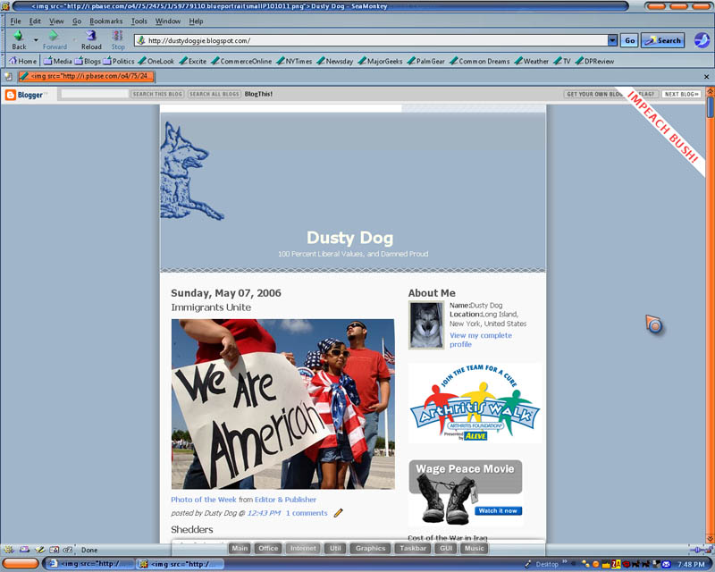 This is Seamonkey's image, and the browser I used to design my template. My two concerns with this were that there was no differentiation between the articles and the sidebar, both being white. Also, of course, the header bar is too wide. But, I designed it to have the dog at the left side.
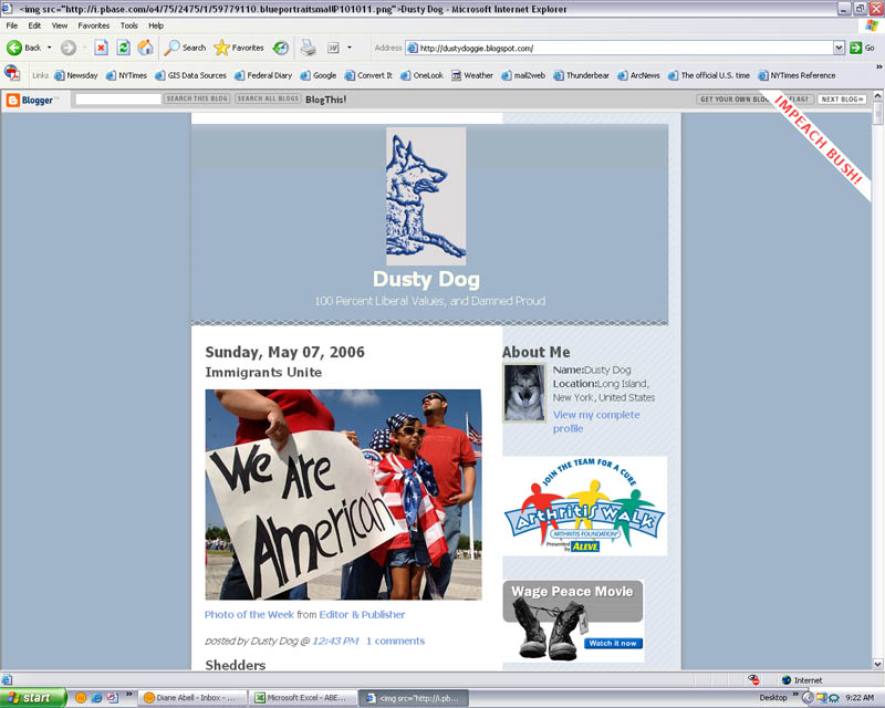 This is what I saw when I got to work. The most noticible difference is the blue sidebar and the centered dog image.
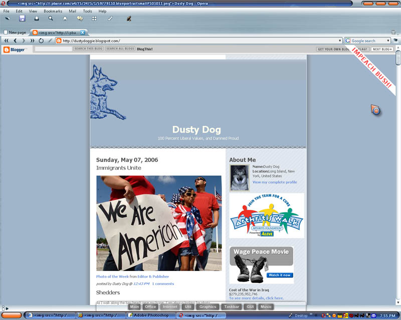 Finally, this is what I see when I use Opera. It has both the left sided dog and the blue sidebar. It's what I was mostly trying to accomplish when I designed the template.
So everyone, what are you seeing? Any particular preferences? However, Opera was what I was trying to design, except the header being too wide. I need your comments.
Thank you for your support.
posted by Dusty Dog at
5/08/2006
![]()
3 comment(s):
I see the image you put in the middle. The picture of Zuki looks better centered than on the left.
I like the new look.... great work!
By Anonymous, at
1:52 AM
Anonymous, at
1:52 AM
Looks even better now without the image on top.
By Anonymous, at
9:52 AM
Anonymous, at
9:52 AM
I agree. Looks better. Looks great! Now we need a good arguement to liven it up!
By Anonymous, at
11:54 AM
Anonymous, at
11:54 AM
Post a comment
<< Home